javascript/javascript30
[javascript30]Flex Panels Image Gallery
소영
2021. 7. 14. 20:12
Flex Panels Image Gallery
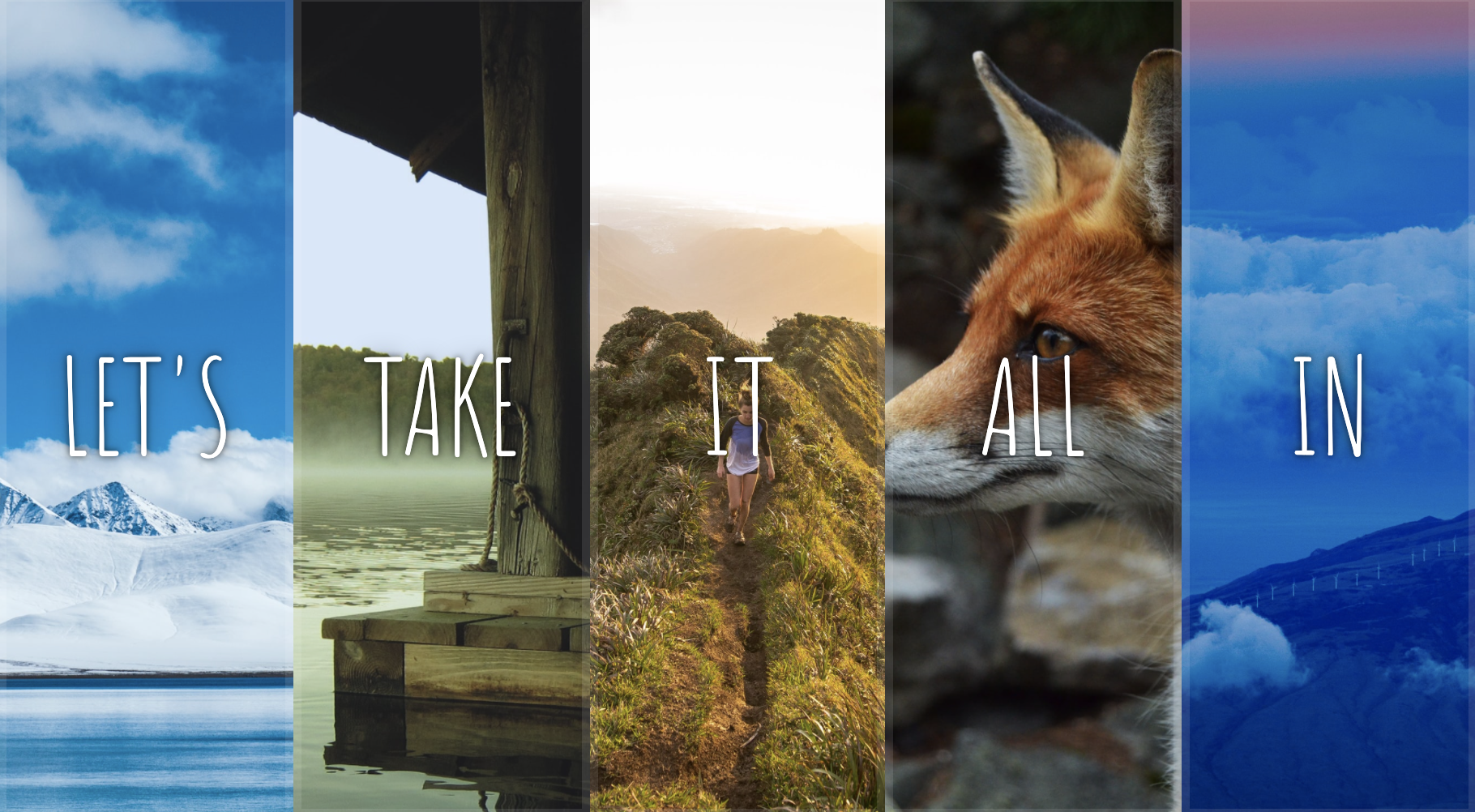
다섯개의 배너를 하나씩 클릭하면 커지고 다시 클릭시 작아진다.
1. flex를 활용하여 이미지및 글자 배치
2. transform과 transition을 이용한 애니메이션 효과
3. .includes()메서드의 활용
코드
<!DOCTYPE html>
<html lang="en">
<head>
  <meta charset="UTF-8">
  <title>Flex Panels 💪</title>
  <link href='https://fonts.googleapis.com/css?family=Amatic+SC' rel='stylesheet' type='text/css'>
</head>
<body>
  <style>
    html {
      box-sizing: border-box;
      background: #ffc600;
      font-family: 'helvetica neue';
      font-size: 20px;
      font-weight: 200;
    }

    body {
      margin: 0;
    }

    *, *:before, *:after {
      box-sizing: inherit;
    }

    .panels {
      min-height: 100vh;
      overflow: hidden;
      display:flex;
    }

    .panel {
      background: #6B0F9C;
      box-shadow: inset 0 0 0 5px rgba(255,255,255,0.1);
      color: white;
      text-align: center;
      align-items: center;
      /* Safari transitionend event.propertyName === flex */
      /* Chrome + FF transitionend event.propertyName === flex-grow */
      transition:
        font-size 0.7s cubic-bezier(0.61,-0.19, 0.7,-0.11),
        flex 0.7s cubic-bezier(0.61,-0.19, 0.7,-0.11),
        background 0.2s;
      font-size: 20px;
      background-size: cover;
      background-position: center;
      display:flex;
      justify-content: center;
      flex-direction: column;
      flex: 1;
    }

    .panel1 { background-image:url(https://source.unsplash.com/gYl-UtwNg_I/1500x1500); }
    .panel2 { background-image:url(https://source.unsplash.com/rFKUFzjPYiQ/1500x1500); }
    .panel3 { background-image:url(https://images.unsplash.com/photo-1465188162913-8fb5709d6d57?ixlib=rb-0.3.5&q=80&fm=jpg&crop=faces&cs=tinysrgb&w=1500&h=1500&fit=crop&s=967e8a713a4e395260793fc8c802901d); }
    .panel4 { background-image:url(https://source.unsplash.com/ITjiVXcwVng/1500x1500); }
    .panel5 { background-image:url(https://source.unsplash.com/3MNzGlQM7qs/1500x1500); }

    /* Flex Children */
    .panel > * {
      margin: 0;
      width: 100%;
      transition: transform 0.5s;
      flex: 1 0 auto;
      justify-content: center;
      align-items: center;
      display: flex;
    }
    .panel > *:first-child{transform: translateY(-100%);}
    .panel.open-active > *:first-child{transform: translateY(0%);}
    .panel > *:last-child{transform: translateY(100%);}
    .panel.open-active > *:last-child{transform: translateY(0%);}
    .panel p {
      text-transform: uppercase;
      font-family: 'Amatic SC', cursive;
      text-shadow: 0 0 4px rgba(0, 0, 0, 0.72), 0 0 14px rgba(0, 0, 0, 0.45);
      font-size: 2em;
    }

    .panel p:nth-child(2) {
      font-size: 4em;
    }

    .panel.open {
      font-size: 40px;
      flex: 2;
    }

  </style>


  <div class="panels">
    <div class="panel panel1">
      <p>Hey</p>
      <p>Let's</p>
      <p>Dance</p>
    </div>
    <div class="panel panel2">
      <p>Give</p>
      <p>Take</p>
      <p>Receive</p>
    </div>
    <div class="panel panel3">
      <p>Experience</p>
      <p>It</p>
      <p>Today</p>
    </div>
    <div class="panel panel4">
      <p>Give</p>
      <p>All</p>
      <p>You can</p>
    </div>
    <div class="panel panel5">
      <p>Life</p>
      <p>In</p>
      <p>Motion</p>
    </div>
  </div>

  <script>
    const panels = document.querySelectorAll('.panel');
    function open(){
      this.classList.toggle('open');
    }
    function openActive(e){
      console.log(e.propertyName);

      if(e.propertyName.includes('flex')){
        this.classList.toggle('open-active');
      }
    }
    panels.forEach(panel=>panel.addEventListener('click',open));
    panels.forEach(panel=>panel.addEventListener('transitionend',openActive));
  </script>


</body>
</html>
알게된 문법
css
flex:0 0 auto /*none*/
display:flex는 알았으나, flex:1; 로 크기를 설정하는 건 처음 알았다.
flex:1 이렇게 설정시 모든 요소가 동일하게 커진다.
JAVASCRIPT
.includes()
배열이 특정 요소를 포함하고 있는지 확인하는 메서드
여기에서는 e.propertyName.includes()형식으로 css 코드가 있는지 확인하려는 용도로 사용함